Google rolls out minor UI and search refresh for major productivity boost
Google is rolling out a minor refresh of the Gmail user interface that might offer a productivity boost to Workspace customers.
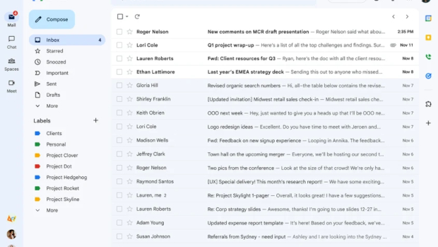
The change will pull Chat, Spaces, and Meet apps closer together as integrated apps that sit in a sidebar on the right.
Google initially announced these changes back in February with a view to rolling them out in April, though it has only just begun that process. Gmail users can expect to see the changes over the coming weeks. Later this year, the features will be added to Gmail for tablets.
By adding icons for Mail, Meet, Spaces and Chat into one sidelined list, Gmail essentially tidies that section up and rids itself of showing multiple conversations from each of the apps. They’re still easy to access and jump into any conversation, but they will instead be in the form of a pop-out when the cursor hovers over the icon.
If you’re resistant to change, the new UI can be switched back to the old one, for the time being. If you have an account that doesn’t have Chat enabled, you will still get the new look, but in a Gmail-only view as a default.
The changes form part of Google’s new approach to Workspace that offers a more unified look and feel. That includes new machine learning capabilities that aim to improve productivity. The new Gmail search functionality is a good example of this.
‘Intent matching’, a machine learning tool that helps find topics related to search queries has been added. With this users should have a better way of finding specific contacts, emails or files. For instance, the feature will prioritise search results for email addresses and first names, rather than those based on last names as it previously did. Searches will also be personalised based on previous searches, so the correspondents you speak with most will appear at the top.
Ⓒ Future Publishing


Subscribers 0
Fans 0
Followers 0
Followers