Slack targets non-tech users with UI design tweaks
Slack has unveiled a range of changes to its team chat app aimed at creating a simpler and more intuitive user experience, as it targets a wider range of users. This includes a message compose button, easier navigation and customisable sidebars.
Early adopters of Slack tended to be tech professionals working in IT or software development. But as use of Slack has boomed in the six years since its launch – with 12 million daily active users, including at many large enterprise businesses – the types of workers relying on the app for collaborating with colleagues has evolved. After tech professionals, the fastest growing use cases are now in sales, marketing, and customer support, said Slack.
“Slack is going more wall to wall,” said Ilan Frank, head of enterprise product at Slack, referring to deployments of the application across entire companies. “As we do that, one of the things we are seeing is that less technical users have different expectations of Slack.
“The mission continues to be the same; to make people’s working lives simpler, more pleasurable and more productive. What’s changing are the people.”
Newbie-friendly features
The aim of the features announced is to smooth the transition for workers adopting Slack as a new way of working.
Taking its cue from e-mail client apps, a “compose” button placed at the top left of the app lets users start a message before deciding the person or channel to send it to. And, as with e-mail apps, the draft message will be automatically saved if left unfinished.

This should make Slack less intimidating for new users who might be overwhelmed by the numerous channels and direct messaging options available to them.
“We wanted to remove that stress when you come into Slack where it’s like ‘wait a second, now you have to decide which channel you should write it into,’” said Frank. “In this case, when you click on the compose button you get a panel that allows you to type your new message. Only after writing the message and keeping it as a draft would you then have to pick a DM or a channel to put it in.”
He added: “You could actually think about a future when Slack actually suggests channels for you to communicate in, based on what you have written and where you will get the most effective response.”
Another addition to the navigation bar is a pair of arrow buttons to move back and forth between channels, rather than relying on keyboard shortcuts. Only a small proportion of users actually use keyboard shortcuts, Slack said. Beside the navigation arrows, a clock icon will show browsing history to let users jump to previous channels quickly.
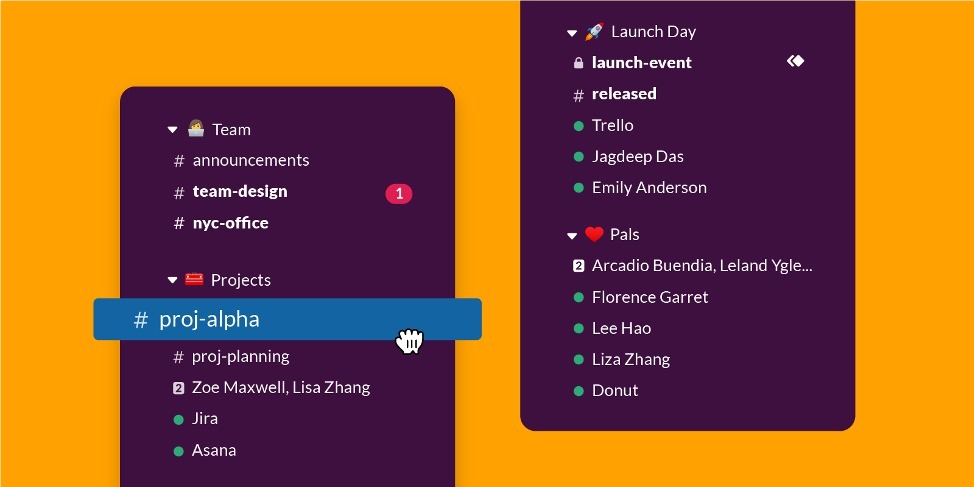
The sidebar panel can also now be customised, with the ability to create folder-like sections. Users do this by dragging and dropping channels, direct messages and apps to categorise and prioritise them. Sections can be created for a specific project or just to group new urgent conversations.

The ability to tap into third party apps, such as videoconferencing or polling tools, is an important part of the Slack experience for many users, with more than 1,800 third party integrations available, aside from apps and workflows created internally. But these do not always feel accessible to new users. The addition of a lightning bolt button in the message input field serves as a shortcut to access apps without switching between windows.
Team collaboration becoming mainstream
Demand for team collaboration tools has grown significantly in recent years, with channel-based communications offering an alternative to email for interactions with co-workers, as well as aiding collaboration with remote workers. The market for social software and collaboration in the workplace is set to reach $4.8 billion in 2023, according to Gartner.
Slack’s success attracted others to the market, most notably Microsoft, which launched its rival application Teams in 2017.
Although Microsoft is a significant rival, Slack has publicly welcomed the competition, claiming it is a validation of channel-based communications (although it has also hotly contested Microsoft’s user adoption claims).
Larry Cannell, a research director at Gartner, said that Slack’s updates are part of a wider and longer-term ‘mainstreaming’ of products like Slack and Teams.
This is necessary for two reasons, he said: “First, to make them more approachable and less intimidating for nontechnical users. Not everyone is comfortable with things like slash commands or can remember where to find a useful feature. These tools need to work for late adopters.”
Second, he said, these products must be able to evolve along with the ways users incorporate them into daily workflow. “Think of how different Twitter, Facebook or Snapchat are today because of what features users most leveraged. This is a constantly changing dance between form and function,” he said.
The new Slack interface features will be completed in “several weeks”. The features will be available to users on all Slack payment tiers, including the free version, although the sidebar channel sections will only be available on paid plans.
IDG News Service


Subscribers 0
Fans 0
Followers 0
Followers